First off — I’ll admit my poor attempt at a click-bait title. Prediction, Solar flares, RHESSI Mission, all big words cramped into a single sentence. But if you’re still reading the next paragraph, that means it was successful!
This was something which I did as a demo task (for demonstrating one’s coding proficiency) for GSoC 2018. Although, there were other demo task suggested by the organization, I thought of proposing my idea as demo task and voila! it was selected.
The entire work is available here. Explore and have fun !
Table of contents
- Background
- How did I land up on this?
- Getting my Hands on Data
- Data Preprocessing
- Identifying the Relevant attributes
- Visualizing the data and making observations
- Relation between Flare duration, Peak count rate and Total count with respect to Energy
- Density plot to visualize the distribution of the Flare wrt. Energy
- Countplot to Visualize distribution of flares in the different energy ranges
- Relation between Energy density and Duration(in seconds)
- Histogram and Density Curve of Flare Duration
- Relation between Duration and log(count of flare)
- Distribution of flares over time duration wrt. Energy
- Solar Flares trend over the Years (2002-2016)
- Sunspots per Energy - Mapping Flares on the Sun
- Yearly analysis of Flares
- Number of solar flares per year
- Predicting Solar Flare energy
- Further Analysis
Background
The Sun has a distinct activity that can affect life on earth on a very massive scale, called Solar Flare. As per wikipedia and the internet, a solar flare is a sudden flash of increased Sun’s brightness, usually observed near its surface. Flares are often, but not always, accompanied by a coronal mass ejection.
Solar flares produce high energy particles and radiation that are dangerous to living organisms. However, at the surface of the Earth we are well protected from the effects of solar flares and other solar activity by the Earth’s magnetic field and atmosphere.
There are many organizations working on monitoring the Sun activities( one of them the flares activity ). These organizations have an amazing resources. One of them is the Reuven Ramaty High Energy Solar Spectroscopic Imager which is NASA solar flare observatory (RHESSI) and they are trying to predict the Sun flares and the active region using their amazing computing machines and of course extraordinary staff .
How did I land up on this?
My task was open ended - apart from the task ideas that were specified, one can come up with his/her own ideas too having only one restriction - whatever you do that should be connected with space science. Some of the task were related with DCT index, OMNI Data, Finding relation between DST and OMNI data, etc. I have been reading around space science in my leisure time, hence, I had many topics to explore. But the news of an impending solar flare (the flares between 9 - 14 Feb 2018) changed my direction and thus, I went to dig more into solar flares. Interestingly, I found many observatories solely dedicated to the task of finding trends in solar flare and their activities. These activities range from energy to origin of the flare. Luckily, NASA has opened up the data recorded by them over the last fifty years to public. They also have put up data from various other observatories apart from RHESSI.
So going through all those observatories, I finally zeroed in on RHESSI. Apart from analyzing RHESSI mission data for the task, I had a backup plan for predicting Solar Radiation (You always need a backup plan !) in case RHESSi didn’t go too well.
Getting my Hands on Data
Making your algorithms and models do work on the dataset is a very easy thing when compared with the scraping of data, data cleaning and all other preprocessing tasks.
The entire description about RHESSI mission is available at the RHESSI website. The data is available through a web page which gives the user the choice to download data from 2002 onwards. One has to wait for sometime (maybe a few hours) before you get the link to your mail of the data.
Now, the catch here is that the data in its original format is of FITS format. Yes, I too had heard this format for the very first time. FITS stands for Flexible Image Transport System. Now, this format, quite popular in the scientific community, is quite unheard among the general. Now, python handles FITS format, but, it’s quite tedious process, So, I decided to convert it into CSV format. Fortunately, NASA has given a list of tools that can do this work of converting FITS into CSV. Once converted to CSV, a python script was used to join the CSV files.
Data Preprocessing
Now that the CSV files had been generated, it was time to look into the actual data. Importing the usual libraries to see and visualize the data, I was able to identify what I needed to do on the current data to get more insights from it. The main preprocessing that I did was -
- Information about data - whether its object, int or float
- Distribution of the values across mean, median, standard deviation, etc.
- Checking for null values (Yes, there were too many !)
- Handling the date values
- Renaming the columns (Not a major thing, but earlier these had dot between them)
The simple python function helped me parse the date values into year, month and day.
  def parse_date(sdatex,stimex):
      datex = datetime.strptime(sdatex, '%Y-%m-%d')
      timex = datetime.strptime(stimex, '%H:%M:%S')
      return datetime(datex.year,datex.month,datex.day,timex.hour,timex.minute,timex.second)
Identifying the Relevant attributes
The data has 18 attributes and approximately 114000 entries. My first approach was to use PCA to identify the related attributes. But, only 18 attributes makes it very difficult to get these relations as PCA eliminates attributes and thus, may end up eliminating some important one. So, I switched back to the more traditional way of getting information - through visualization.
The first thing I did was to plot a correlation heatmap for all the attributes. I ended up getting total counts, intensity (peak/cs) and duration as important features.
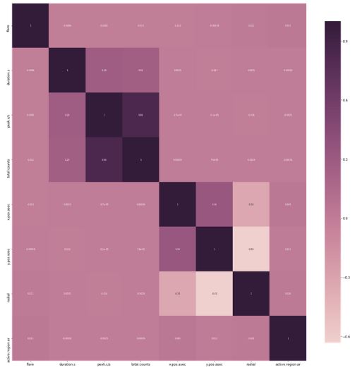
One can look at the heatmap notebook here.
Visualizing the data and making observations
From all attributes, for any given flare, there are three distinct attributes that will largely influence determination of its energy range. These are -
- Duration
- Peak Intensity
- Total Counts
Now, the task is to find how these influence each other and the remaining attributes. For the plots below, I used a subset of the parsed dataset having 1000 rows and 4 columns namely - energy_kev, duration_s, peak_c_s and total_counts.
The subset was mainly used to plot the diagrams to get more information about the distribution of values across these 4 features and how they affect the energy of flare. It was assumed that any pattern that would be displayed in these 1000 flares would also be continued over the rest of the dataset.
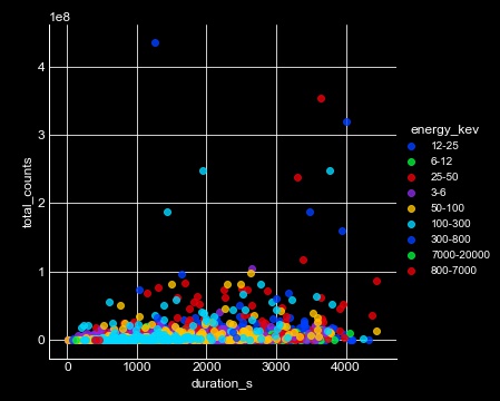
Relation between Flare duration, Peak count rate and Total count with respect to Energy
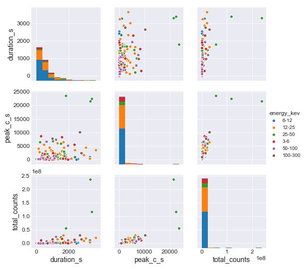
Majority of the flares are of the energy range 6-12 KeV. Another small majority of flares are of range 12-25 KeV. Flares having energies greater than range 25-50 KeV are very sparse and rare in occurrence.
Density plot to visualize the distribution of the Flare wrt. Energy
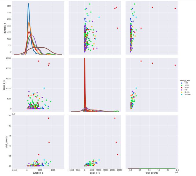
A KDE plot or density plot helps in having more balanced view of the above relationship. The density plot offers a way to see the distribution of values of flares over attributes duration, peak and total_counts according to the energy of each flare.
The first kde plot for duration and energy revealed that a most number of flares of the range of 6-12 kev had the longest duration in all flares, followed by flares of 12-25 kev. This helped to infer that flares having energies over 6-12,12-25 ranges usually occur in cluster and hence these have a high value of total_counts associated with them. Flare having very high energy are rare in occurence and usually occur for short burst span.
The second kde plot tells about the intensity distribution of flare over the different ranges. From the plot, we can infer that flares of range 12-25 have very high intensity as the flare peaked to some specified peak energy value, a number of times in a second (given by peak count rate).
Countplot to Visualize distribution of flares in the different energy ranges
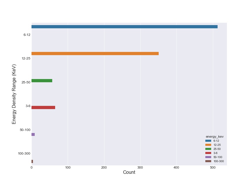
The countplot visualizes the distribution of flares from the data_part dataframe(having 1000 rows of the entire dataset). Note that the 6-12 KeV energy range dominates all the other value range. Now, I assumed the same trend continues for the entire dataset.
Countplot on the entire dataset to verify assumption
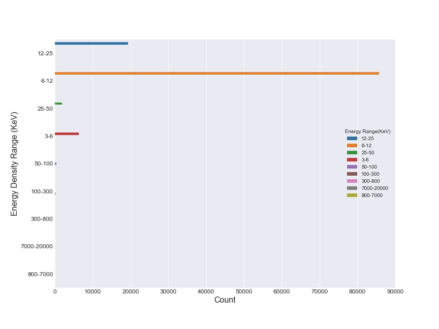
Hence, I confirmed assumption by plotting a countplot on the entire dataset. A majority of flares appear in the energy range of 6-12 KeV, followed by the 12-25 KeV range.
Relation between Energy density and Duration(in seconds)
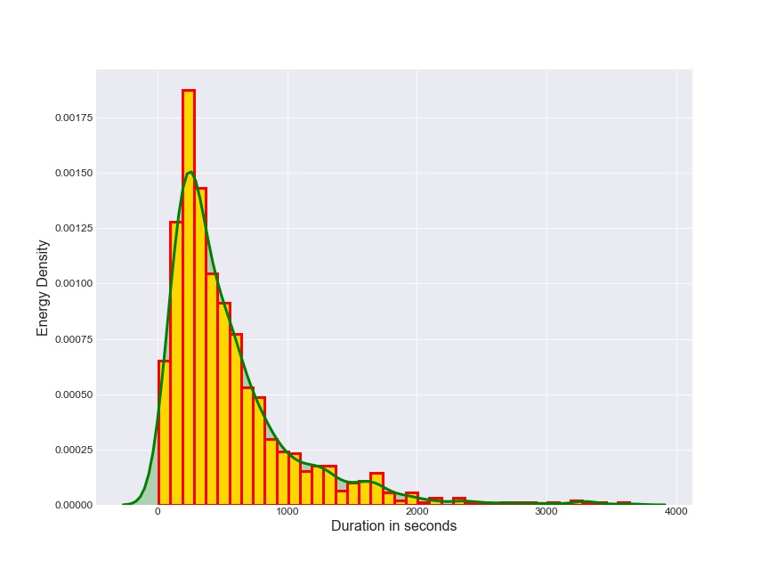
This plot tells that short duration flares have a very high energy associated with them. This can be verified fron the fact that a solar flare having a high energy is very rare in occurence and occurs in a very short period of time. The first kde plot from density plot also verifies this as we can see that higher energy flare(100 kev and above) has a very short duration when compared with flares (3-100 kev energy). Thus, flares of high energy occur suddenly and die out quickly.
Histogram and Density Curve of Flare Duration
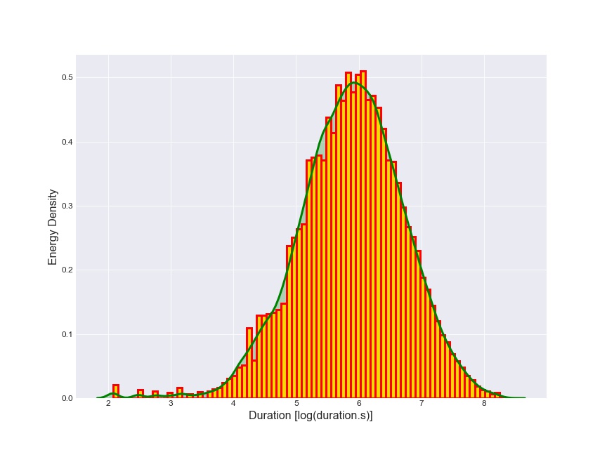
This plot investigates the above relation between energy and duration. The only differnce is that I have taken logarithm of duration in order to get a more clear picture of the above relation.
Relation between Duration and log(count of flare)
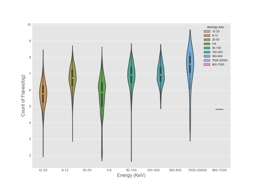
Distribution of flares over time duration wrt. Energy
This plot illustrates how flares of different energies are distributed over the time.
Solar Flares trend over the Years (2002-2016)
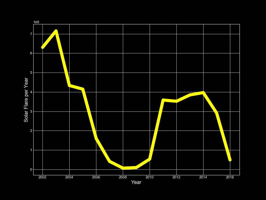
Everything uptill now has explored the relationship of the attributes with each other. Analyzing solar flares over the last 15 years revealed another hidden path and thus my journey began towards exploring sunspots.
Sunspots per Energy - Mapping Flares on the Sun
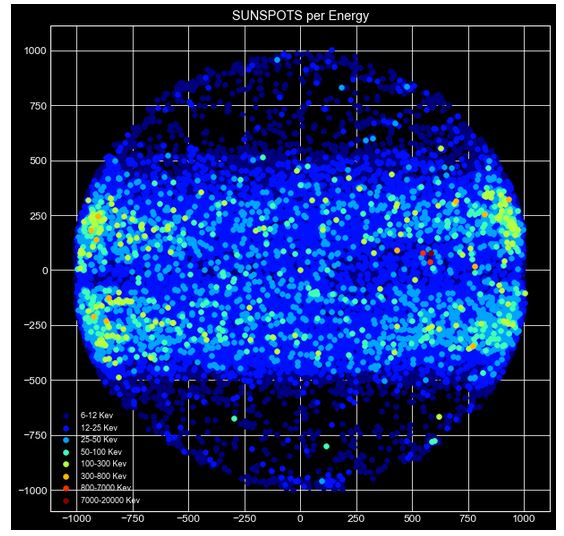
The inspiration for plotting sunspots came from an earlier analysis that NASA had done on the Rhessi data.
First, I filtered out events which were not solar events. This was done by using flags where rows having values SD and NS were filtered out. These two events denote occurence of non-solar events. Then, the energy feature’s value was made inclusive by addding two new columns - energy.kev.i for initial energy and energy.kev.f for final energy in the given energy range.
For example, a flare of earlier having energy range 6-12 kev would now have energies 6 and 12 included in the energy range. The inclusion of these energies was based on the fact that sunspots have a definite lower and upper bound of temperature. The flares are now mapped on a sphere using x and y coordinates of the origin of flare. This was done in order to get a view at the origin of the flare and how each flare’s origin is distributed over the sun. The mapping revealed an interesting pattern. It shows that most of the flares originate from distances very near from the sun’s center.
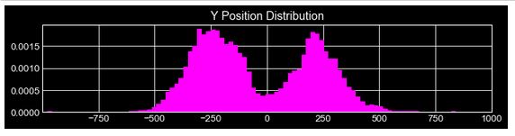
There was an almost equal distribution of flares over the two hemispheres of the sun. This pattern was verified by plotting the y-coordinates of origin in the following plot. We get an almost uniform distribution of flares near the low lattitudes near the solar equator.
This was further confirmed by a site on Sunspots by Berkeley University on page 4 under Modern Research.
Yearly analysis of Flares
Flare events over the Years
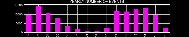
Plotting the number of events for each year reveals another symmetric property. It looks like we are having a pattern forming around here, like all the dots are finally connecting.
In order to confirm any kind of existing pattern, I made up a solar flare intensity plot.
Mapping solar flares intensity over the years
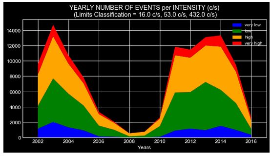
The same pattern arises when we map the intensity of flares for the period of 2002 - 2016.
Some help from Google and I have myself staring at the wikipedia page of Solar Cycle. The knowledge of solar cycle lead me to investigate this further and verify it by data visualization.
Number of solar flares per year
According to the Wikipedia,
The solar cycle or solar magnetic activity cycle is the nearly periodic 11-year change in the Sun’s activity (including changes in the levels of solar radiation and ejection of solar material) and appearance (changes in the number and size of sunspots, flares, and other manifestations).
  plt.style.use('fivethirtyeight')
  new_df.groupby(['year'])['energy_kev'].value_counts().unstack().plot(kind='bar')
  plt.ylabel('Number of Flares', fontsize=16)
  plt.legend(title='Energy Range(KeV)', loc='best', prop={'size': 10})
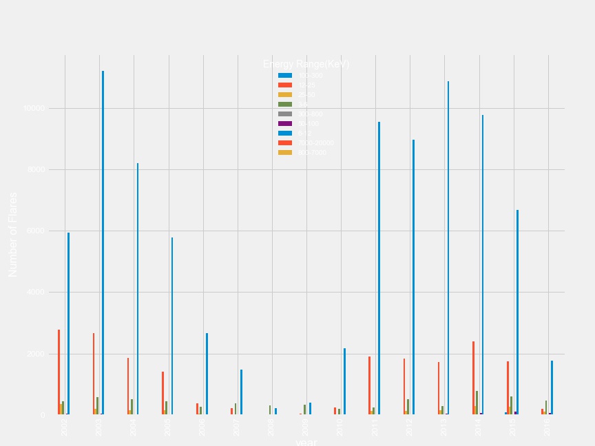
11 Year Solar Cycle confirmed !!!
A special mention to unstack() method here. While making this plot, I was at a dead end. I was trying to disperse flare values for each energy over the years. No Google, Stackoverflow, matplotlib, seaborn helped me here. After a long time (Yup, I was stuck at this for 9 - 10 hours !), from the depths of Stackoverflow, in someone’s answer I got a mention of unstack() method. I decided to try it as I was running out of ideas. And, it worked ! Kudos to that unknown warrior !
Predicting Solar Flare energy
Now, the hard part being over, I started messing around the dataframes to get best predictions for energy range of a flare. The usual preprocessing steps took place again on a new dataframe. Apart from the steps stated above, I additionally took a few more steps like -
- Dropping attributes namely
flag_1,flag_2,flag_3,flag_4,flag_5,date_start,date_peakanddate_end. These had many null values. - After checking out that there are no remaining null values, I enumerated the categorial energy values. This helps the model to learn faster and better.
Once all the necessary steps had been taken care of, I made train and test sets for model. I made the split in an 80 - 20 fashion for train and test set respectively.
Prediction Time !!!
I made 7 models to test out the prediction. All thanks to scikit-learn, the models were made in no time. Here are all the models that were tested -
- Linear Regression
- Logistic Regression
- Decision Tree Classifier
- Random Forests Classifier
- K Nearest Neighbours
- Gradient Boosting Classifier
- MLP Classifier (scikit’s Neural network)
The linear regression model performed very poorly. The logistic regression model performed decently at 78.6 % accuracy on the test set. But the top positions were taken by Gradient Boosting Classifier, Random Forests Classifier, Decision Tree Classifier having an accuracy of 87 %, 86 % and 82 % respectively.
Here’s the entire summary on test set -
| Model | Accuracy Score |
|---|---|
| Linear regression | 18.74 % |
| Logistic regresion | 78.59 % |
| Decision Tree Classifier | 81.23 % |
| Random Forests Classifier | 86.10 % |
| K Nearest Neighbours | 76.14 % |
| Gradient Boosting Classifier | 86.78 % |
| MLP Classifier | 75.13 % |
Further Analysis
The current analysis is only one kind of many that can be performed on Solar Flares. Another approach is to use time series analysis to get another interpretation of the data.
By the time I got around to publish this post it’s actually closer to a month ago. The results of GSoC are out in next three days. It’s going to be long three days. Also, my end semester exams are starting from 25th April, so I might take a break for two weeks. But, stay tuned for next post about FIFA Players Analysis which I did during this semester.